Auditory Data Design
Informed by an interdisciplinary literature review, we developed an analytical framework of data sonification practices as well as a voice user interface (VUI) representing data from the U.S. Census and the American Community Survey. We then conducted usability test sessions with this VUI to evaluate the potential of data exploration via conversational interfaces, as well as to present recommendations for future work.
Contributions
Task Analysis
UX Writing (Voice Design)
Usability Testing
Literature Review
Framework Development
Collaborators
Michelle Carney
Peter Rowland
Mentors
Marti Hearst
Steve Fadden
Background
According to National Public Media, one in six Americans own a smart speaker as of January 2018, and this population has more than doubled in the course of one year. With the rise of both virtual assistants and software-embedded devices, audio-first interactions are becoming more prevalent in daily life. However, there are not yet industry standards for sharing data via sound experiences – particularly through emergent smart speaker interfaces.
Overview
This project was motivated by open data initiatives, particularly those run by government agencies. In anticipation of the 2020 U.S. Census, we began evaluating existing web-based data exploration tools, conducting cognitive walkthroughs of the U.S. Census’s 2010 website, interactive maps, and “Profile America” audio stories. While this informed a general understanding of data exploration, we imagined a future in which one would be able to make sense of data exclusively by ear. With support from the Berkeley Center for New Media, we focused on the following research question: how might audio enable us to understand complex datasets?
︎Experience map of existing census data exploration tools.
How might audio enable us to understand complex datasets?
Literature review
We first conducted an in-depth literature review of prior work related to “data sonification,” or using non-speech audio to convey information. Our analysis was initially based on “auditory graphs,” shaped by visual analogs (i.e., histograms, scatter plots, pie charts, etc). Spanning across various disciplines – including human-computer interaction, accessibility, music, and art – the range of papers demonstrated great variety: some demonstrated more creative intent with memorable, musical designs, while others focused on accurate, scientific representations. Papers also demonstrated differences in whether the researchers mapped sounds to real or simulated data.
Observed differences in the data sonification literature manifested in two primary areas:
- the rigor – or absence – of experimental procedures, and
- the quality of stimuli used – whether researchers used abstract MIDI sounds or audio mapped to semantic meaning (e.g. using the sound of rain to communicate precipitation).
Framework development
For our framework, we thus plotted selected papers along two dimensions: Objective vs. Subjective Sonification Approach on the vertical axis, and Abstract vs. Functional Data on the horizontal axis. Key papers were grouped by the following representational characteristics: Trends, Clusters, Spatial Relationships, and Distributions.
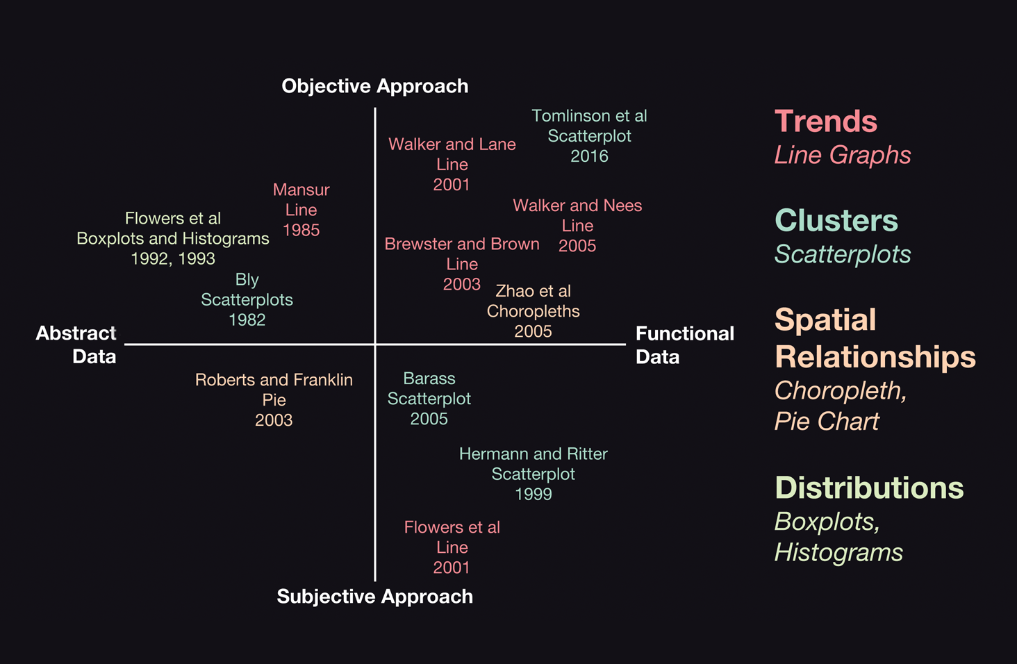
︎Conceptual framework for existing auditory data representations.
Voice prototype
While reviewing the literature, however, we discovered that prior research often lacked associated audio files, since much of it is decades old. We therefore reproduced three different sonification methods, using the softwares Ableton Live and Audacity:
- an audio choropleth map proposed by Zhao et al, using pitch to represent population data by state and region from the 2010 Census,
- an audio line graph inspired by Brown and Brewster, using timbre to represent employment data by age group from the 2015 American Community Survey (ACS), and
- an audio pie chart designed by Franklin and Roberts, using rhythm to represent employment data from the ACS again, but by education level.
Using the prototyping software Invocable (formerly Storyline), we used these auditory data designs to develop our own voice user interface, an Alexa skill called “Tally Ho.”
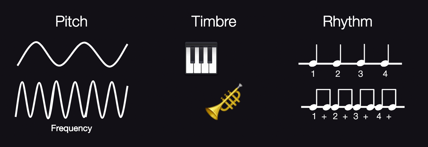
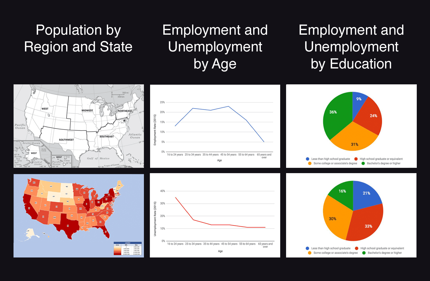
︎Summary of corresponding visual representations.
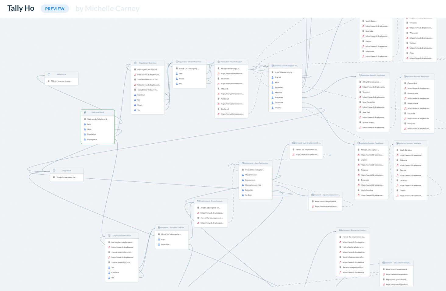
︎Overview of the conversational prototype.
Usability testing
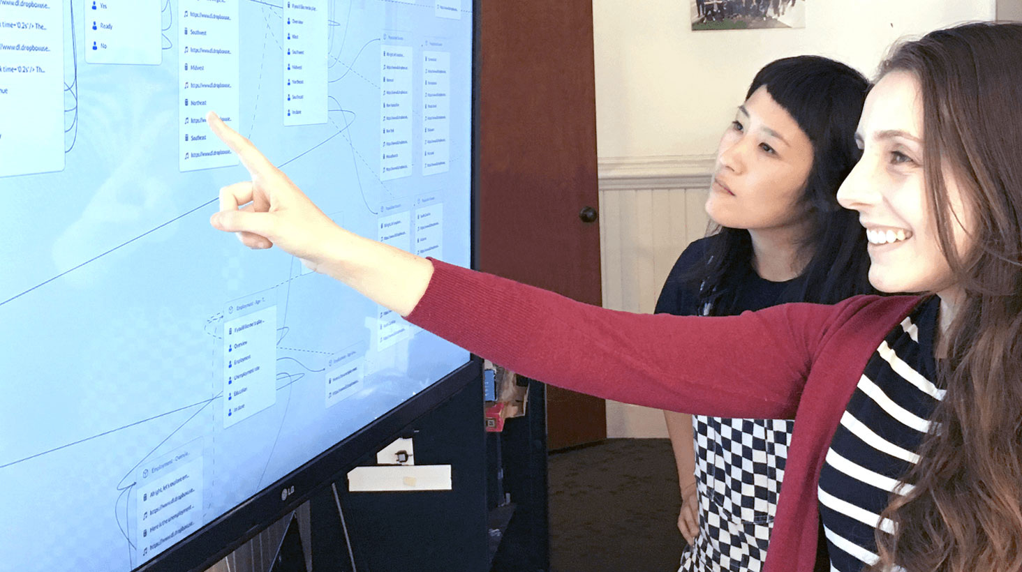
With this VUI, we conducted in-person usability testing to evaluate the potential of auditory data exploration via a contemporary, conversational interface. We sought and recruited a five-person sample that would demonstrate varying degrees of familiarity with: smart speakers, musical knowledge, and census data. During each moderated session, the participant was presented each of the three different audio representations in a randomized order, then asked follow-up questions about initial impressions, perceived difficulty, and user expectations.
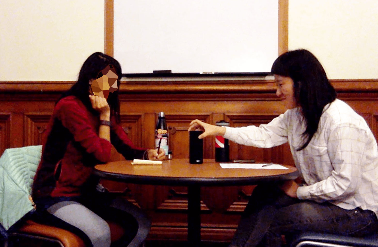
︎ Conducting usability testing on the Alexa-enabled Amazon Tap.
Outcomes
Our prototype used pitch, timbre, and rhythm to represent data points, category differences, and overall trends: users were able to hear these distinctions and interpret them mostly correctly after hearing a scripted explanation from the VUI. (More documentation, including the full report and audio files, can be found on the Berkeley School of Information project page. )
Our results suggest that users generally enjoyed the experience of hearing data – finding it “cool,” “fun,” and even “powerful” – but also had difficulty remembering insights as passive listeners. Even with repetition, participants lacked precise recall; 4 out of the 5 participants noted that it was “confusing” to remember what they had just heard.
Takeaways
Given that the average human primarily relies on capabilities of sight first and sound second, it is unsurprising that VUIs tend to require a greater cognitive load and more training than traditional visual interfaces. Among the participants who already owned smart speakers, the devices were mainly used to perform simple tasks like playing music and setting alarms. Understanding sonified data was an entirely new type of experience. One way to overcome this novelty factor would be to conduct a longitudinal study to assess changes in both performance and enjoyment of the experience over repeated interactions.
With the growth of conversational interfaces – in tandem with the rise of ubiquitous computing – we remain optimistic about the way forward in designing auditory data representations. As Hermann and Ritter suggest, humans are “capable [of] detect[ing] very subtle patterns in acoustic sounds, which is exemplified to an impressive degree in the field of music, or in medicine, where the stethoscope still provides very valuable guidance to the physician.” Continuing to develop new interaction patterns for auditory data exploration will benefit not only those who are visually impaired or limited in numeracy skills, but also anyone who is curious about making sense of data through alternative means.